使用 Vue3 Teleport 製作對話框(Modal)
Vue3 Teleport 對話框
12 min read

在這篇文章中,我會使用 Vue Teleport Component 以及一些實用的 Vue 技巧來製作一個簡單且可以復用的 Modal。
Code Repository: Github
前言
在網頁開發中,對話框(Modal)是常用的組件,它可以在用戶與網頁交互時,以不打斷原有流程的方式展現額外的資訊、功能或提醒等。但如果不小心設計不當,對話框也可能會妨礙用戶體驗。在 Vue 3.0 版本中新增了 Vue Teleport 功能,可以將組件的內容透過 Teleport 傳送到指定的 DOM 節點,使用 Teleport 來製作對話框,即便對話框組件本身被包在複雜的結構中,也能簡化其實現的方式。
什麼是 Teleport?
「Teleport」翻譯為中文是「傳送」,在 Vue 3 中,Teleport 是一個內置組件,可以將一個組件內部的一部分模板 “傳送” 到該組件的 DOM Tree 以外的指定 DOM 節點上。簡單來說,這代表我們可以實現渲染這個模板到 Dom Tree 的任何地方,即使該組件嵌套在深層的 Dom 之中,可以將它理解為哆拉 a 夢的任意門!
最常見的需求像是常被置於頂層的 App 組件中的 Modal, Popup, Notification 等組件,就非常適合使用 Teleport 來設計,如果這些組件可以完全的跟 App Dom 完全分開來渲染,開發者們可以更容易地處理這類組件,因為若有個組件有許多父層(parents)時,做 event handing, 設定 position, 調整 z-index 就會變得非常困難。
Setup Project
使用 Vite 的 vue-ts 模板創建專案。
Copied!pnpm create vite@latest teleport-modal --template vue-ts
另外安裝 Tailwindcss 來裝飾模板,詳細設定在這裡。
Copied!pnpm install -D tailwindcss postcss autoprefixer
npx tailwindcss init -p
建立對話框 Modal 組件
先來做一個簡單的對話框組件, 然後使用 Tailwindcss 來裝飾它:
新建檔案 ModalConfirm.vue:
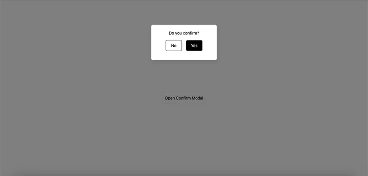
Copied!<template>
  <div class="absolute inset-0 overflow-hidden bg-black bg-opacity-50">
    <div class="mt-24 flex min-h-screen items-start justify-center text-center">
      <div
        class="w-64 rounded-md bg-white p-5 text-center text-black shadow-lg"
        role="dialog"
        aria-modal="true"
      >
        <h3>Do you confirm?</h3>
        <div class="flex justify-center gap-4 py-4 text-white">
          <!-- We will handle these emits later -->
          <button
            @click="$emit('close')"
            class="w-16 rounded-md border border-black bg-white py-2 text-black"
          >
            No
          </button>

          <button
            @click="$emit('close')"
            class="w-16 rounded-md border border-black bg-black py-2 text-white"
          >
            Yes
          </button>
        </div>
      </div>
    </div>
  </div>
</template>
將 ModalConfirm 引入 App.vue:
Copied!<script setup lang="ts">
  import {ref} from 'vue'
  import ModalConfirm from '@/components/ModalConfirm.vue'

  const show = ref(false)

  const openConfirm = () => {
    show.value = true
  }

  const closeConfirm = () => {
    show.value = false
  }
</script>

<template>
  <div class="flex justify-center items-center min-h-screen">
    <button
      class="border p-2 rounded-md hover:bg-blue-400 hover:text-white"
      @click="openConfirm"
    >
      Open Confirm Modal
    </button>
    <ModalConfirm v-if="show" @close="closeConfirm" />
  </div>
</template>
你可以看到,這裡有一些邏輯來控制 Modal 的開啟及關閉,另外也使用 emit 來控制 ModalConfirm,目前畫面如下圖:
破壞開啟 Modal 時的 UI
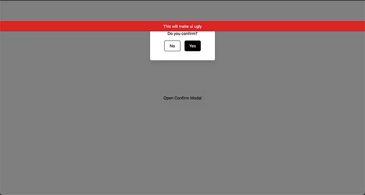
Copied!<script setup lang="ts">
  import {ref} from 'vue'
  import ModalConfirm from '@/components/ModalConfirm.vue'
  const show = ref(false)
  const openConfirm = () => {(show.value = true)}
  const closeConfirm = () => {(show.value = false)}
</script>

<template>
  <div class="flex justify-center items-center min-h-screen">
    <button
      class="border p-2 rounded-md hover:bg-blue-400 hover:text-white"
      @click="openConfirm"
    >
      Open Confirm Modal
    </button>
    <ModalConfirm v-if="show" @close="closeConfirm" />
    <div
      class="absolute top-20 bg-red-600 w-full h-10 flex justify-center items-center text-white"
    >
      This will make ui ugly
    </div>
  </div>
</template>
這裡新增了一個使用 absolute 定位的元素,來模擬當 modal 被置於巢狀的結構中時可能會發生的情形,它有可能被其他元素所干擾。
來看一下 DOM 裡發生了什麼事!
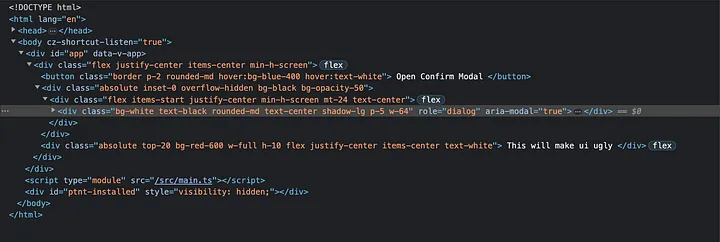
你會發現我們的 ModalConfirm 跟 This will make ui ugly 元素是被渲染在同一個層級。那我們有什麼更好的方法將 Modal 渲染在其他地方呢?!
沒錯,就是 Teleport !
新增 Teleport (Vue Teleport component)
在 index.html 新增一個 id=“modal” 的元素,我們的 Modal 將會被渲染在 Vue App 之外。
Copied!<!DOCTYPE html>

<html lang="en">
  <head>
    <meta charset="UTF-8" />
    <link rel="icon" type="image/svg+xml" href="/vite.svg" />
    <meta name="viewport" content="width=device-width, initial-scale=1.0" />
    <title>Vite + Vue + TS</title>
  </head>
  <body>
    <!-- Vue App mounted is here  -->
    <div id="app"></div>
    <!-- Modal component will appear here -->
    <div id="modal"></div>
    <script type="module" src="/src/main.ts"></>
  </body>
</html>
接著回到 App.vue:
Copied!<script setup lang="ts">
  import {ref} from 'vue'
  import ModalConfirm from '@/components/ModalConfirm.vue'

  const show = ref(false)

  const openConfirm = () => {
    show.value = true
  }
  const closeConfirm = () => {
    show.value = false
  }
</script>

<template>
  <div class="flex justify-center items-center min-h-screen">
    <button
      class="border p-2 rounded-md hover:bg-blue-400 hover:text-white"
      @click="openConfirm"
    >
      Open Confirm Modal
    </button>
    <!-- Will render the content in element with id=modal -->
    <Teleport to="#modal">
      <ModalConfirm v-if="show" @close="closeConfirm" />
    </Teleport>

    <div
      class="absolute top-20 bg-red-600 w-full h-10 flex justify-center items-center text-white"
    >
      This will make ui ugly
    </div>

  </div>
</template>
使用了 Vue3 的 <Teleport> 組件,我們可以將 Modal 渲染於 Vue DOM 的外部,Teleport 接受一個 prop to (算是 CSS 選擇器),這裡傳入 #modal 來對應 index.html 內的 <div id=“modal”>。
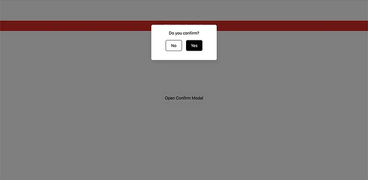
這時再去開啟 Modal,就會發現 Modal 不再被 absolute 定位的元素所遮蓋,如下圖:
來看一下目前 DOM 的情況: 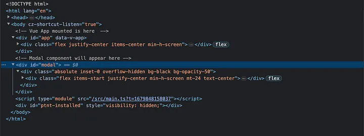
太棒了!現在我們的 Modal 邏輯存在於 Vue app 中,但 Modal 卻是渲染在外部且並不會與其他元素有衝突。接下來我們再做近一步的優化。
建立 Composable (組合式函數)
來建立一個 Composable 讓顯示 Modal 的邏輯封裝在一個共用函數中,這樣我們就可以複用這段程式碼來開啟不同的 Modal。
在專案中建立 composables 資料夾,然後建立一個名叫 useModal.ts 的文件:
Copied!import { ref } from 'vue'

// tracking of component to render
const component = ref()

// tracking of whether to show modal
const show = ref(false)

export default function useModal() {
  return {
    component,
    show,
    // open/close methods for modal
    showModal: () => (show.value = true),
    closeModal: () => (show.value = false),
  }
}
以上是一個簡單 composable,return 兩個 refs 及兩個方法: component 用來追蹤不同 Modal 要渲染,show 用來控制 Modal 的顯示,另外兩個方法則是用來開起、關閉 Modal。
再回到 App.vue 改成使用 useModal:
Copied!<script setup lang="ts">
  import { markRaw, ref } from 'vue'
  // import the composable
  import useModal from '@/composables/useModal'
  import ModalConfirm from '@/components/ModalConfirm.vue'

  const modal = useModal()

  // set the modal component to the ModalConfirm component and open it
  const openConfirmModal = () => {
    modal.component.value = markRaw(ModalConfirm)
    modal.showModal()
  }
</script>

<template>
  <div class="flex justify-center items-center min-h-screen">
    <button
      class="border p-2 rounded-md hover:bg-blue-400 hover:text-white"
      @click="openConfirmModal"
    >
      Open Confirm Modal
    </button>
    <teleport to="#modal">
      <ModalConfirm v-if="modal.show.value" @close="modal.closeModal" />
    </teleport>
    <div
      class="absolute top-20 bg-red-600 w-full h-10 flex justify-center items-center text-white"
    >
      This will make ui ugly
    </div>
  </div>
</template>
現在我們將開關 Modal 的邏輯及 data 更換成使用 composable 取代,使用 openConfirmModal 方法來指派 ModalConfirm 組件給 Modal,為了達到此目的我們使用了 markRaw helper。 MarkRaw 詳細介紹
如果我們現在測試它,它應該可以正常運作,只是我們將邏輯都轉移至 composable 之中,而且是可以複用的。
新增動態組件 (Vue Dynamic component)
既然我們已經有了 ModalConfirm 組件,如果我們想要動態的顯示不同的 Modal 基於其他使用情境,該怎麼做呢? 因為在實際專案中應該不會只有一種 Modal。還記得我們有加入 component 在 useModal composable 嗎?我們可以將它與 Vue 的動態組件功能一起來顯示不同的 Modal。
我們來建立第二個 Modal,他跟第一個 Modal 很相似,僅用來模擬不同 Modal 的情境,來建立 ModalOverview.vue 吧:
Copied!<template>
  <div class="absolute overflow-hidden inset-0 bg-black bg-opacity-50">
    <div class="flex items-start justify-center min-h-screen mt-24 text-center">
      <div
        class="bg-white text-black rounded-lg text-center shadow-xl p-6 w-64"
        role="dialog"
        aria-modal="true"
      >
        <h2 class="text-lg font-bold">Overview of items:</h2>
        <ul>
          <li>Item 1</li>
          <li>Item 2</li>
          <li>Item 3</li>
          <li>Item 4</li>
          <li>Item 5</li>
        </ul>
        <div class="flex justify-center py-4">
          <button
            class="border border-black bg-white text-black rounded-md w-16 py-2"
            @click="$emit('close')"
          >
            Close
          </button>
        </div>
      </div>
    </div>
  </div>
</template>
現在我們將第二個 Modal 加進 App.vue:
Copied!<script setup lang="ts">
  import { markRaw } from 'vue'
  // import the composable
  import useModal from '@/composables/useModal'
  import ModalConfirm from '@/components/ModalConfirm.vue'
  import ModalOverview from '@/components/ModalOverview.vue'

  const modal = useModal()

  // set the modal component to the ModalConfirm component and open it
  const openConfirmModal = () => {
    modal.component.value = markRaw(ModalConfirm)
    modal.showModal()
  }

  const openOverviewModal = () => {
    modal.component.value = markRaw(ModalOverview)
    modal.showModal()
  }
</script>

<template>
  <div class="flex justify-center items-center min-h-screen">
    <div class="flex gap-3">
      <button
        class="border p-2 rounded-md hover:bg-blue-400 hover:text-white"
        @click="openConfirmModal"
      >
        Open Confirm Modal
      </button>
      <button
        class="border p-2 rounded-md hover:bg-blue-400 hover:text-white"
        @click="openOverviewModal"
      >
        Open Overview Modal
      </button>
    </div>
    <teleport to="#modal">
      <component
        :is="modal.component.value"
        v-if="modal.show.value"
        @close="modal.closeModal"
      />
    </teleport>
    <div
      class="absolute top-20 bg-red-600 w-full h-10 flex justify-center items-center text-white"
    >
      This will make ui ugly
    </div>
  </div>
</template>
現在你可以看到,我們引入 ModalOverview 和新增了第二個按鈕,並將其指派給了 composable 和開啟 Modal。更重要的是我們使用了 <component :is=“”> 動態組件來切換 Modal, is prop 可以接受組件名稱或是組件本身。我們的 case 則是使用來自 useModal composable 內的 component,第二個 Modal 畫面如下:

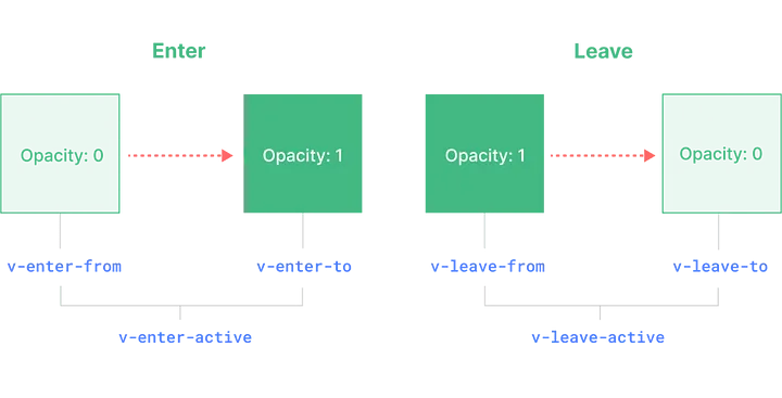
新增 Transition (Vue Transition component) 最後,我們來新增 Transition,讓 Modal 在畫面上呈現漂亮的動畫效果,我們可以使用 Vue 的另一個原生組件 — <Transition>
在 App.vue :
Copied!<script setup lang="ts">
  import { markRaw } from 'vue'
  // import the composable
  import useModal from '@/composables/useModal'
  import ModalConfirm from '@/components/ModalConfirm.vue'
  import ModalOverview from '@/components/ModalOverview.vue'

  const modal = useModal()

  // set the modal component to the ModalConfirm component and open it
  const openConfirmModal = () => {
    modal.component.value = markRaw(ModalConfirm)
    modal.showModal()
  }

  const openOverviewModal = () => {
    modal.component.value = markRaw(ModalOverview)
    modal.showModal()
  }
</script>

<template>
  <div class="flex justify-center items-center min-h-screen">
    <div class="flex gap-3">
      <button
        class="border p-2 rounded-md hover:bg-blue-400 hover:text-white"
        @click="openConfirmModal"
      >
        Open Confirm Modal
      </button>
      <button
        class="border p-2 rounded-md hover:bg-blue-400 hover:text-white"
        @click="openOverviewModal"
      >
        Open Overview Modal
      </button>
    </div>
    <teleport to="#modal">
      <Transition>
        <component
          :is="modal.component.value"
          v-if="modal.show.value"
          @close="modal.closeModal"
        />
      </Transition>
    </teleport>
    <div
      class="absolute top-20 bg-red-600 w-full h-10 flex justify-center items-center text-white"
    >
      This will make ui ugly
    </div>
  </div>
</template>

<style scoped>
  .v-enter-active,
  .v-leave-active {
    transition: opacity 0.5s ease;
  }

  .v-enter-from,
  .v-leave-to {
    opacity: 0;
  }
</style>
我們需要新增額外的 CSS classes 在 style 中,以下是 vue 的 Transition 樣式表:
這樣我們的 Modal 就大功告成啦!!
結論 經過這教學,我們學會處理 Vue Teleport component,以及 Vue Transition component,也使用了最佳實踐並提取了額外的邏輯到 Composable。最後我們也學到了 Vue Dynamic component,讓我們能夠渲染不同型態的 Modal。
有用的資源